Information & Design
Designing for humans
Designing for humans
Download 'printer-friendly' PDF version (File size: 107 KB)
- Gerry Gaffney. March 19, 2001. Drawings by Gina Ellis.
Designers of physical objects have guidelines that describe their customers' characteristics.
They can use these guidelines to specify things such as:
Designers of physical objects also have readily available feedback. Events in the physical world inform designers of what design decisions need to be revised.
In contrast, designers of 'virtual' objects such as web sites and software often have very little feedback, and may have false assumptions about their customers.
It is surprising how many designers of web sites, kiosks and the like never get to interact with real users.
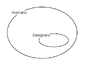
We know that designers are part of the human race, as shown in the following diagram.

The diagram states that:
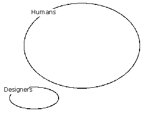
However, an alien looking at our web sites and software might develop a different picture, as shown in the following diagram.

The diagram states that:
In other words:

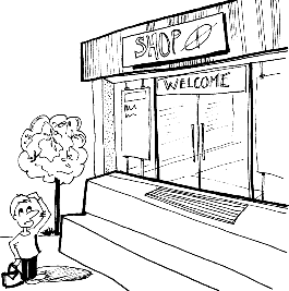
Like the shop on the right, web sites look professional and well made. If it were a web site we would say it has a nice simple address or URL ('Shop').
It presents a welcoming face to the customer. It says 'Welcome' and it has a doormat. If it were a web site, of course, stepping on the doormat would likely surprise the visitor with a splash screen or similar unnecessary interruption.
It has some visually pleasing graphical design elements (the tree outside).
It is very difficult for the customer to get in, as the steps are too high.
In addition, although you can't see it in the diagram, the inside of the shop is a bit of a mess. All products have been arranged by colour, rather than by name or any other system that the customer might recognise.
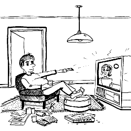
There is a burly gentleman just inside the door who grabs you as soon as you walk into the shop, sits you down and forces you to watch a 5-minute video advertisement. If you don't stand up immediately the advertisement finishes, you are forced to watch it again.
If you manage to find something you want to buy, you have to give a blood sample and sign up for lifetime membership.

People skim ruthlessly - particularly in online environments.
If possible, they avoid reading entirely.
They tend to pick out 'key' words and phrases. However, these may not be the words and phrases that you envisaged.
If there is a choice between doing something and reading about doing it, most people will just do it.
One of Gary Larson's marvellous cartoons shows a man talking to his dog. Although the man is speaking sentences, all the dog hears is 'blah blah Ginger blah blah blah blah blah blah blah Ginger'.
The cartoon is captioned 'What we say to dogs' and 'What they hear'.
A similar effect works on the web. The following diagram shows an order form ('what we write').

Below is an approximation of what a customer might see when reading it.

The reader may pick out a piece of salient or interesting information. In this instance, the reader has picked out $120. This is unfortunate because the largest market for the product is in the USA, so we would rather that they noticed the US dollar price ($66).
Some people know what an overhead camshaft is; most people neither know nor care. This may be baffling and disappointing to the auto enthusiast.
Some people know about digital certificates, processor speeds, HTML, XML, and the like; most neither know nor care.
Most people don't care how much design effort went into your web site or application, and they don't care how clever you are.
Some people may like detailed information on who built a supermarket and whether structural steel or reinforced concrete was used, but most will be happy as long as it doesn't fall down.

People are often reluctant to provide personal information.
Many people will simply lie to you if you try to force them to reveal personal information.
People rate privacy policies as being an important factor in their perceptions of web sites.
Given a choice between the easy way and the right way, people will choose the easy way.
If it is easier to pick up the phone or visit the store, people will do that rather than use your web site.
If it is easier to use someone else's web site, people will do that rather than use your web site.

Many people disclose their PIN to others.
Many people allow colleagues to 'impersonate' them to log on to computers and networks.
Many people use the same PIN for multiple purposes.
People decide for themselves what level of security they will accept.
Most people have a task in mind when they approach a web site.
It is unlikely that they will be interested in watching a video or animation if it prevents them from completing their task.
They may go elsewhere or abandon the task if it takes too long.
It is not possible to quantify what 'too long' means.

In humans, no great evolutionary leaps have occurred in the last 10 years, nor are they likely in the next 10.
People are still driven by the same things that motivated them before the advent of the Internet.
It is unlikely that people will change the way they think and behave just because your company has launched a new web site or service.
If you don't interact with real people during analysis and design, how can you design products that they can use? Involving customers is simple, cost-effective and productive.
How can you design good web sites if you don't test them with customers? Testing is simple, effective and cheap.
Be sceptical of technologies that will change the world, revolutionise the way we think, and transform the way we do business.
Remember - people are intuitive. Web sites, software and mobile telephones are not.