Information & Design
Designing for humans
Designing for humans
 Download 'printer-friendly' PDF version (File size: 16 KB)
Walkthroughs are a cost-effective technique for testing a user interface. There are several variations - this document describes a simple paper-based technique.
Use walkthroughs to get early validation of design decisions, and to get feedback from several people at once. Walkthroughs are particularly effective for testing gross navigation. You can also conduct walkthroughs if you do not have the resources for formal usability testing.
A significant weakness of paper-based walkthroughs is the fact that they do not show interactive behaviour (such as button-presses). Walkthroughs can include an interactive screen-based presentation to overcome this.
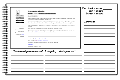
Each participant is given a booklet containing tasks and screens. Screens are presented one at a time, and participants are asked to specify the actions they would expect to take on each screen (for example, entering data, clicking a button or hyperlink).
Participants are encouraged to write on the booklet. After each screen is presented, the group as a whole is asked to comment on any issues with the screen, and what elements did and did not work. It is important to log these comments, as participants may not be clear in their written comments.
After each screen, participants are told what action the hypothetical user has taken, and the next screen in the sequence is presented.
The walkthrough continues until all screens and tasks have been completed.
At the end of the session, it is appropriate to administer a questionnaire to confirm that the participants fit the demographic profile required, and to get subjective feedback and comments.
A typical walkthrough session with four tasks lasts for 2 hours.
The tasks to be completed should be based on the scenarios used during the design process, and should be representative of the tasks the interface is designed to support. It is important to exercise as many elements of the interface as possible. If there are any elements of the user interface that you suspect may be troublesome, make sure the tasks use those elements.
Tasks should be worded in a simple and straightforward fashion, and should not describe any aspects of screen interactions.
Each task should be printed on a page of its own in a large font. Consider a different colour paper for the tasks so that participants can easily refer back to them. Using an overhead projector to display the tasks makes it easier for people to remain focused on the current activity.
Participants should be representative users, although the ability to have many participants provides the opportunity to have other stakeholders participate.
Ensure that screens contain appropriate data. For example, if a screen would contain a customer name, make sure that this appears on the relevant screen in the booklet.
It is critical to conduct a pilot session to uncover missing steps or data, and to identify unclear instructions or questions.
Use large format paper (such as A3) in landscape orientation.