Information & Design
Designing for humans
Designing for humans
Download ‘printer-friendly’ PDF version (File size: 125 KB)
This document describes the redesign process for the Information & Design website.
The process we followed is not the only way to undertake such a redesign. For example, it is perfectly feasible to conduct a redesign without consultation and without usability testing. However, following a structured approach improves the probability that the new version will serve the requirements of the business and the needs of the users.
This paper was written by Gerry Gaffney and Philipp Pagendarm. Thanks are also due to Peter Grierson and Su Dharmapala, who were also involved at various stages of the design process.
The Information & Design website was first launched in 1998. Since then, one major structural change had been made.
By 2001, several factors indicated that a significant redesign was needed.
Analysis consists of gaining a sufficient understanding of:
Because of the nature of our relationship with our audience, we had a large amount of information from our existing users. Most of this feedback tended to be positive, and to relate the availability of the free resources on our site. Clearly, it would be important for us to continue to maintain those resources. We had conflicting feedback on the visual aspect of the design. Some users strongly supported the simple nature of the site design, while others commented that it was ‘bland’ or lacking colour.
The amount of user needs analysis conducted was significantly less than we would typically recommend for most clients (who may not have a strong day-to-day relationship via the web with their customers).
While we felt we understood the business requirements, these had never been articulated.
We conducted two internal workshops to consider the issues and requirements, and to develop design goals and scenarios. The workshops took less than a day in total – this represents excellent value in terms of return on effort, because the outputs of these workshops ifnormed the subsequent design activity. Refer to the ‘Website Requirements’ document in the accompanying zip file. (File size: 433 KB).
In our case, our primary constraint was budget and resourcing. We did not employ additional resources for the redesign, so work was done when the pressure f other immediate project activity was low. Technology constraints did not present any difficulty, as our hosting service provided all the features we required.
It is important when conducting a redesign to ensure that all current content is identified, and an appropriate action is taken for each piece of content.
This is a tedious job, but one which, if neglected, can cause much difficulty in terms of problems with the redesigned site (especially in terms of broken links and missing content).
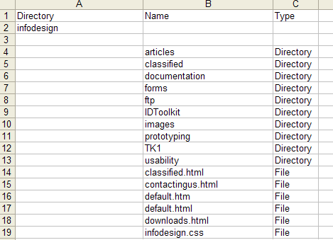
We automated part of this task by using the command line to get a text list of every element on the current site, and using that as the basis of a simple spreadsheet (as shown here).

See the ‘Content Audit Extract’ spreadsheet in the accompanying files for a more detailed extract.
For each item in the spreadsheet, we noted its name, location, type, nature (for example, graphic, document, form), size, owner, users, date created (or last updated), and incoming links. This allowed us to decide which items would be deleted, transferred to the new site, or treated in some way and then transferred to the new site.
It can be hard to decide what information will be required – erring on the side of caution is sensible. You can easily discard excess information about any item; it is more time-consuming to revisit items in order to gather information you failed to get on the first pass.
(During the design stage, we specified the location of each item in the redesigned site structure.)
Once sufficient analysis and information gathering has been conducted, it is appropriate to move into a stage of active design.
The usual process is to use personas (user profiles), scenarios and specified requirements to conduct one or more participatory design workshops. This is the opportunity to get buy-in from various business stakeholders, to elicit specific user input, and to get initial design ideas. On client projects, this activity often brings into the open issues and requirements which have not yet been adequately tackled.
Reviewing the requirements enabled us to identify the total amount of content required, and we undertook affinity diagramming exercises to group this information in meaningful ways. ‘The Content Cards Extract’ document in the accompanying files shows some of the content. We printed this on cards and sorted the information into groups in order to come up with a structure for the new site.
Note that we did not have a card for every item in the site. For example, individual graphics were known to be attached to specific documents, so identifying the location of the document also implied the location of the graphic.
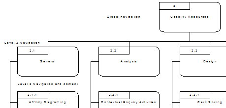
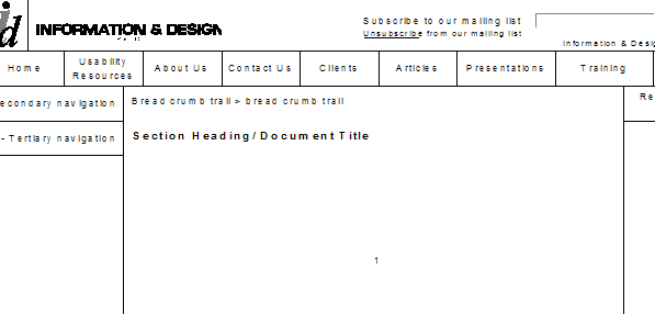
We held several informal design sessions. We made a decision to maintain, where practical, the same simple navigational structure already in use, but to break it down into smaller and more modular elements – this would improve the user experience and make the site easier to maintain.

The structure was documented, and each element given a number. This was documented in a ‘Site Structure And Templates’ document (contained in the accompanying files).
Evaluation can take place at various stages of the design process. For a large site, initial evaluations can and should be conducted early – even before a working prototype is available.
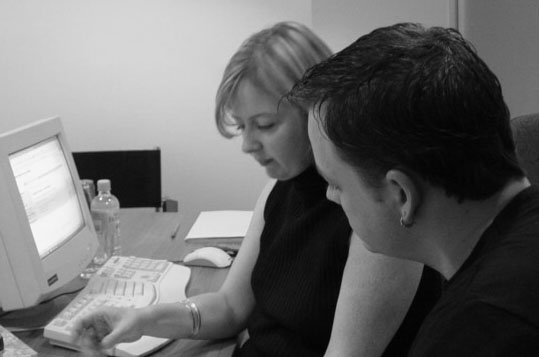
Since our site is relatively small, with homogenous pages, we conducted a usability test using a working prototype of part of the site.

We tested using several scenarios, including the scenarios that had been developed during the analysis stage – this is good practice as it allows you to confirm whether the design is meeting the original requirements.
See the Usability Test Plan for more detail on the usability testing, and the Usability Test Report for the results. Both these documents are in the accompanying files.

The usability test revealed several issues – most of which were relatively easy to address. We made several minor changes to the design as a result of the testing.
Now that we had a site whose operation was satisfactory from a user perspective, we needed to implement the site, and to document it for maintenance purposes.
We used Microsoft Active Server Pages (.asp) and JavaScript. We also Cascading Style Sheets (CSS). The earlier version of the site had used relatively primitive CSS.
Navigation was implemented using dynamic navigation. The navigational structure is saved in a file in the root directory. This allows for relatively easy global changes, and has proved enormously more efficient than our previous HTML version.
Several issues arose during this stage. For example, how would we manage the fact that we were switching from HTML to ASP as our file extension? We did not want to use the ‘redirect’ facility as this has usability issues. Nor did we want to maintain a family of redundant pages. We eventually settled for an error page (for ‘404’ errors) with links to the Home and other commonly-used pages.
Having tested that the design worked, we migrated all content to the new structure, and launched the site in May 2003. We chose a launch date in a holiday (Easter) period so that fewer visitors would be affected by any teething problems (in fact there were no problems).
Over the subsequent several weeks, some problems did emerge – particularly in the differences between CSS-handling between browsers. However, we felt that our reasons for choosing CSS were still relevant, and did not back away from this position.
We documented the steps required to add, delete or change the site content and structure, so that it can be handled by any appropriate person in the future.
We retained the original vision for our site, while improving its operation and appearance, and meeting most of our original goals. We should conduct further usability testing to validate the changes made. However, given that we were satisfied with the results of the testing, and have made minor changes to address these changes, we had a degree of confidence that the new site represents an improvement, from a usability perspective, on the previous version.
The cost of conducting the usability activities described in this document were minimal, resulted in useful changes to the site, and provided a degree of confidence that our new design was ready for launch.
The techniques we used were simple and, if conducted carefully, should result in quality benefits for any organization.